before and after
IMG_5503.jpeg
IMG_7549.jpeg

The word ‘edit’ became a big design buzzword a few years ago. Now it kind of makes me ill when I hear myself say it to a client.

And yet— here we are.

Editing can make a space feel cozy, inviting, and peaceful.

We all spend time every so often cleaning out our refrigerators— clearing out anything that has gone bad and wiping down shelves. Why not do this for the rest of the house?

Clearing space makes room for new ideas.

I like this one.

-Mary-Moore.

before and after
IMG_5553.jpeg
IMG_7546.jpeg

A few photos of a house I staged for sale this spring.

To be perfectly honest, this one is a little bit unfair. My client was in the process of moving when the ‘before’ photo was taken— and none of our houses look good when we are in the middle of moving.

That said— staging makes an enormous difference, whether you are staging a photo shoot, or a shop, or a house for sale. What you want to do is to highlight the architecture, make it clear how to use each space, and make the building sparkle.

I think we achieved that.

-mary-moore.

before and after
Screen Shot 2018-03-08 at 4.13.01 PM.png
four.jpg

In order to make the kitchen work better, we re-arranged appliances, cabinets, and took down the wall separating the kitchen and living room.  Now the kitchen feels like it is in the center of the action-- as it should.

-Mary-Moore.

before and after
Screen Shot 2018-03-08 at 4.09.00 PM.png
two.jpg

I sure do like a good kitchen make-over.  This kitchen had good basic bones-- but needed to get out of the 90's and into something beautiful.  We re-arranged the appliances, added paint, new counters, new lighting, added three new cabinets and ended up with something really wonderful for this young family's future.

Love that.

-Mary-Moore.

vegan leather

Like everybody else out there, I regularly look for inspiration from my fellow designers.  I frequent design blogs, Pinterest pages, and Instagram photos-- looking at the beauty created every day by a large group of very talented people.   I also learn a lot from my peers-- about everything from furniture arranging to current trends to new and innovative products.

Now and then, however, I see something that really rubs me the wrong way.  As a designer, I take seriously my responsibility to give my clients the most truthful, honest answers to their questions about everything from the kitchen sink, to bathroom tile, flooring-- and the best sofa and throw pillows.   Not every product out there will meet the needs of an individual client, and clients can make the best decisions if they have the most information.  It is my job-- therefore--  to know about the ingredients in the products and the companies that sell them-- and to pass on that information as clearly as possible to my client.

In an age in which we are inundated with fake news and false advertising-- it is even more important than ever that designers are fully transparent when selling products to clients.

So... I want to raise concerns over the product that is sometimes called "Vegan Leather".

The word vegan suggests something that is ecologically sustainable and probably healthier for humans as well. Vegan leather, however, is a higher-tech version of vinyl.

Here's the story:  

Leather is a bit of a conundrum-- beautiful and incredibly durable-- but not for every application.  Sometimes a situation is too intense for even leather to handle-- upholstered benches in a nightclub, for example-- and sometimes people object to the political choice of using animal skin on their furniture.   In came vinyl-- or leatherette, naugahyde-- plastic alternatives that tried to mimic leather in their look and feel.

In the design world, however-- vinyl has a pretty bad name.  Bad looks, bad feel-- generally very fake.  No designer wants to use it unless s/he is doing a retro-look kitchen banquette. 

In the last fifteen years the textile industry has responded by using new technology to create a wide selection of faux leathers-- sometimes called 'technology leathers'-- beautiful, soft, totally look-and-feel-like-leather products in every texture and color-- all of them made of 100% plastic.  

"Sometimes referred to as poromerics, poromeric imitation leathers are a group of synthetic "breathable" leather substitutes made from a plastic coating (usually a polyurethane) on a fibrous base layer (typically a polyester)."   Their ingredients are polyurethane, poly-vinyl with a top coat of urethane, polyester, phthalate free polyurethane (polycarbonate)--  all of them poly-based vinyls, i.e. plastics.

Don't get me wrong-- I use these faux leathers regularly for applications that require the water-proofing and sturdiness of plastic -- again, the upholstered benches at a nightclub.  But I am clear with my clients that the product that I am showing them is PLASTIC.  They need to understand that this is not an ecologically sustainable choice in any way other than its longevity (which can at times make something the best ecological choice).  Neither are these faux leathers healthy for humans to live with-- while fine in a cavernous space with lots of ventilation that is only occupied for 12-14  hours of a day-- the off gassing of the poly's is not good for humans to breath in smaller, enclosed spaces like the average home. 

The majority of furniture companies do not care about the environment or about our health-- but they will use a phrase like "vegan leather" that is technically true if it helps them to sell their products.  

Interior designers, however, need to dig a little bit deeper and ask a few more questions.

Don't be fooled by false advertising, people.

-Mary-Moore.

yellow

I love yellow.  In the past I have used it liberally-- on walls, sofas, cabinets, and pillows.  These days I like it in small doses.  There is nothing small about these gorgeous lights-- 1960's exterior runway lights from the Berlin airport--  and the yellow is incredible.

Perfect in the midst of a mostly grey palette.

-Mary-Moore. 

Mary-Moore CathcartComment
on the job

I have to admit that I am a pretty casual person.  I worry about particular details- the details of my clients' projects, the details of special orders I have placed for customers, the details of the parts of my children's lives that I am responsible for-- but beyond that I don't worry too much about everything looking or being "just so" or living up to someone else's image of what my life is supposed to be.  It is my life, after all.

I just do the best I can every day to be me.

-Mary-Moore.
home staging

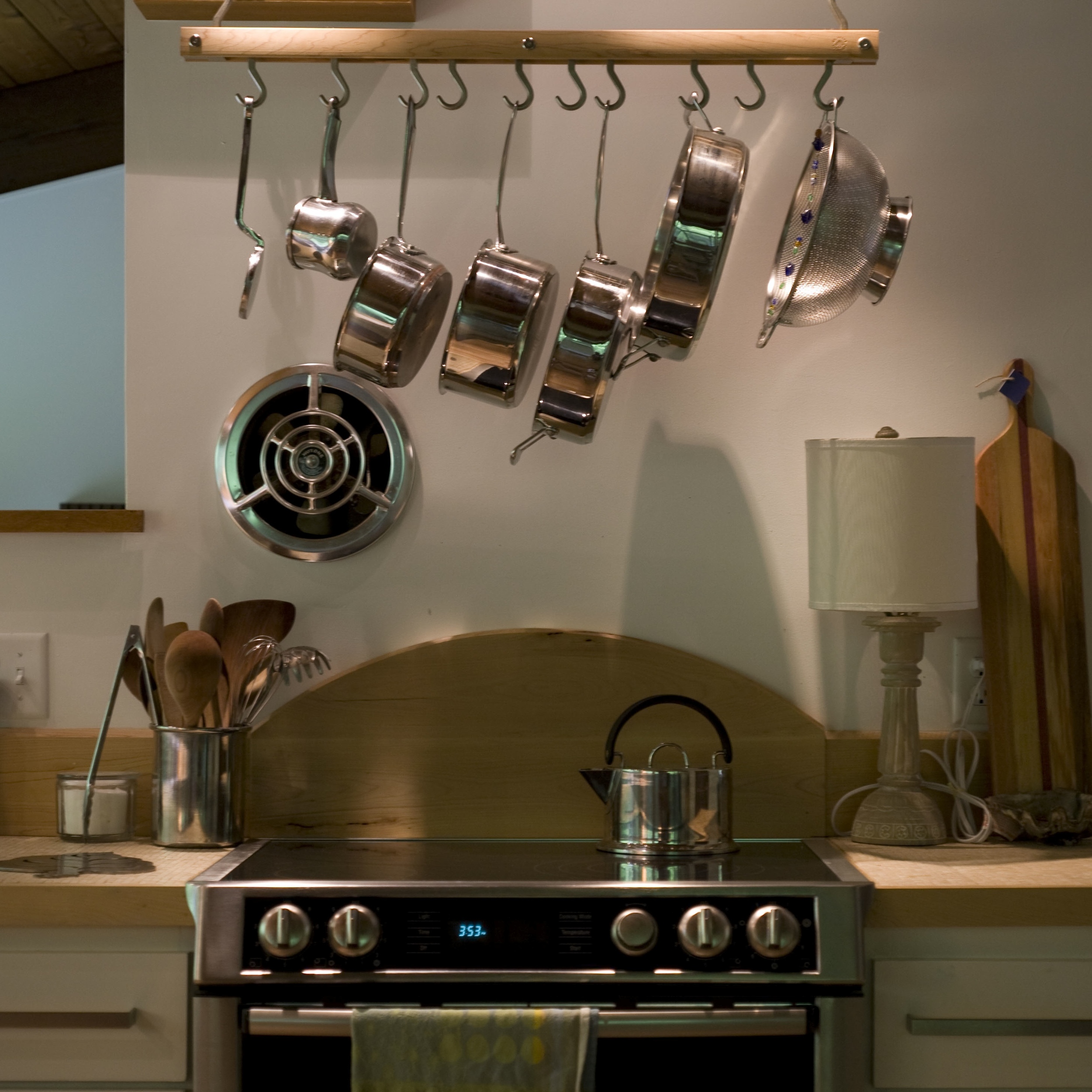
I spent most of the last week staging this house-- which is for sale.  

Staging a house is a little bit of a strange experience for me.  I become totally immersed in the project-- I think about this house all the time for the several days or so that it takes me to complete the project-- and I go through an obsessive process of creating the feeling of home in a previously empty house.  

My own house falls into disorder and chaos while I focus all my attention on this other house-- and by the end of the week my feet and arms are sore, and I can be a little bit confused about where I actually live.  This was a fun one because the owners had beautiful things to use in the house, a great sense of color (I did not change any paint colors other than the floor in the upstairs), and because it was so close by I could easily take many small trips over with more things as I layered my composition of furnishings.   

I am also very, very lucky to live and work with an amazing photographer.   Check out all the photos here

-Mary-Moore.
before and after

No kidding.  

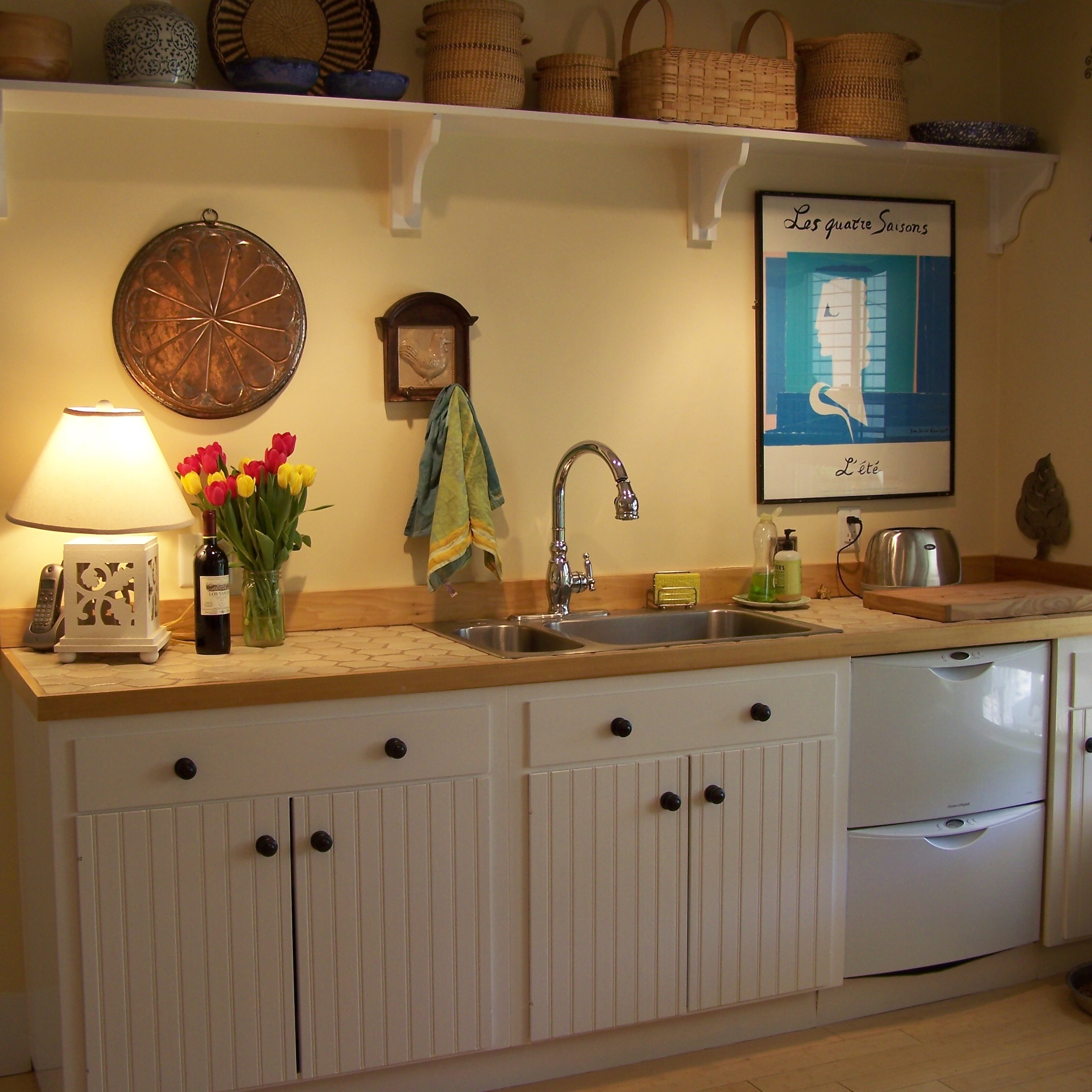
This kitchen was taken back to the studs- in fact the studs actually had to be replaced because the termite damage was so severe- and then a new kitchen built that still feels like an old, farmhouse kitchen.  It ended up being homey and bright-- and did not look like it had been built over the space of a few weeks.  

I love my job.

-Mary-Moore.
mid-project

There are moments during a construction project that are incongruous- but wonderful.  

This bathtub has been in this bedroom for months. Bathtubs have to be on site for the plumbers to do their "rough-in"- so that they can make sure they are putting the pipes in the right place- and then the tub/s sit, neglected and dusty, until it is actually time to install them.  This project has had many delays, so this bathtub has been here long enough that I have thought that we should have planned it this way- to have a tub in the bedroom under those beautiful windows.  

A few years ago I worked on a project in which there was planned a bathtub in the master bedroom- in front of a huge and wonderful square window at one end of the room. 

Why not?

-Mary-Moore.

dining

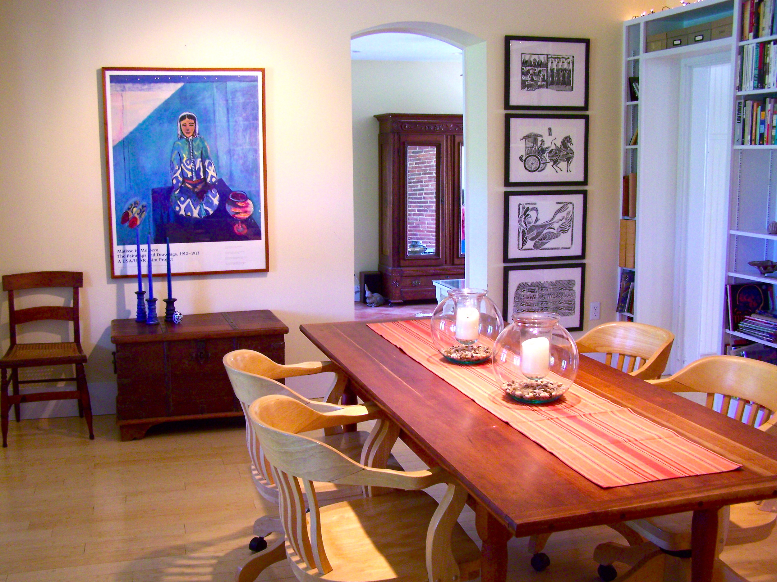
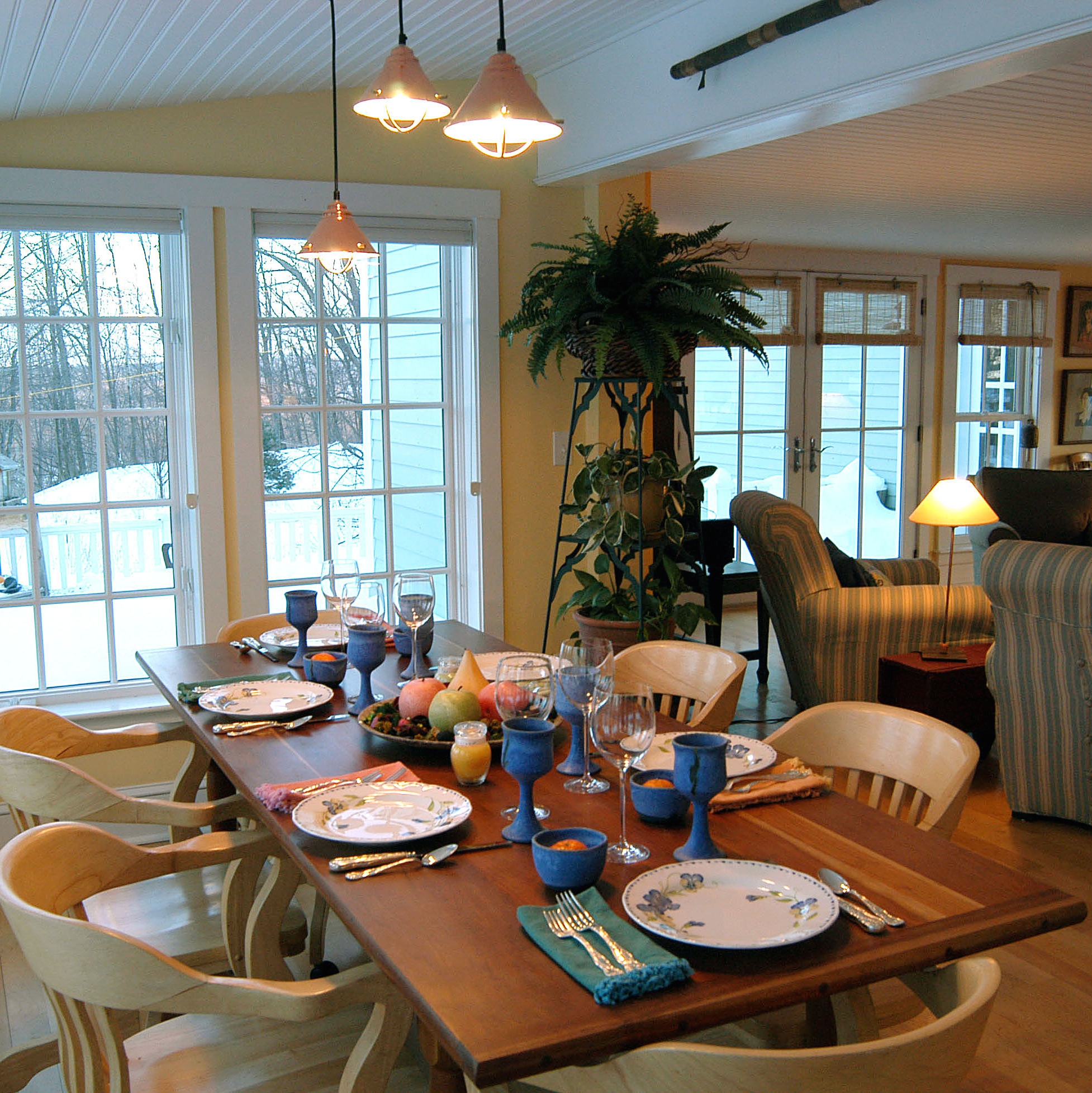
where we meet and eat.

exterior

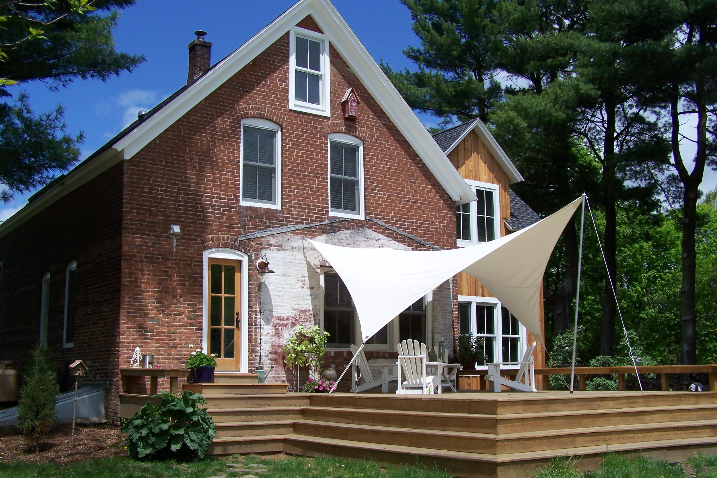
the whole picture.

kitchens

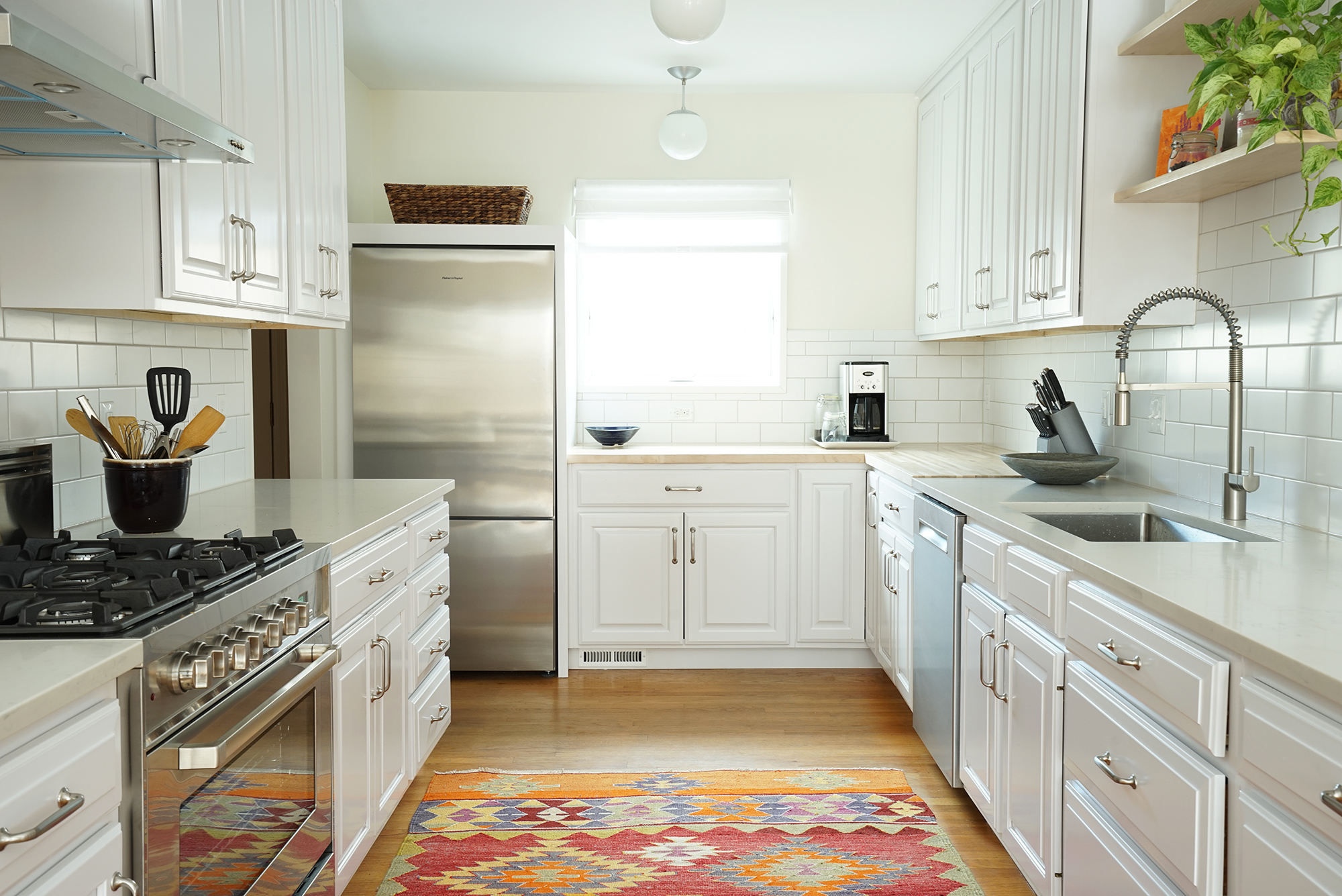
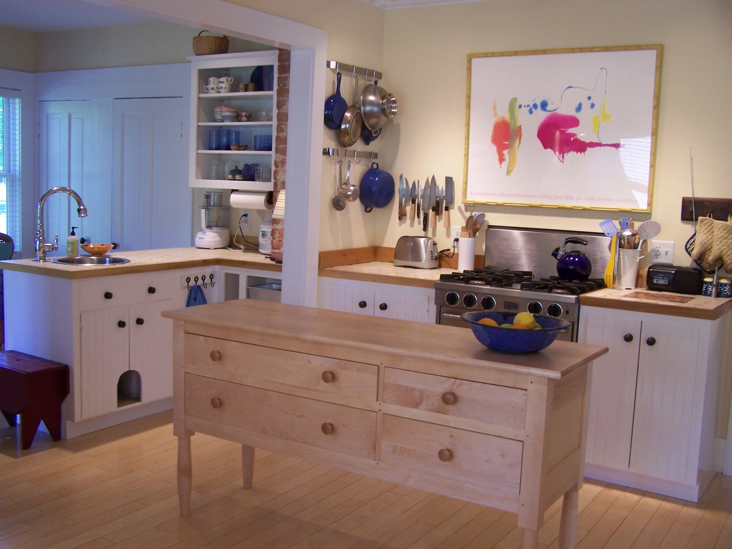
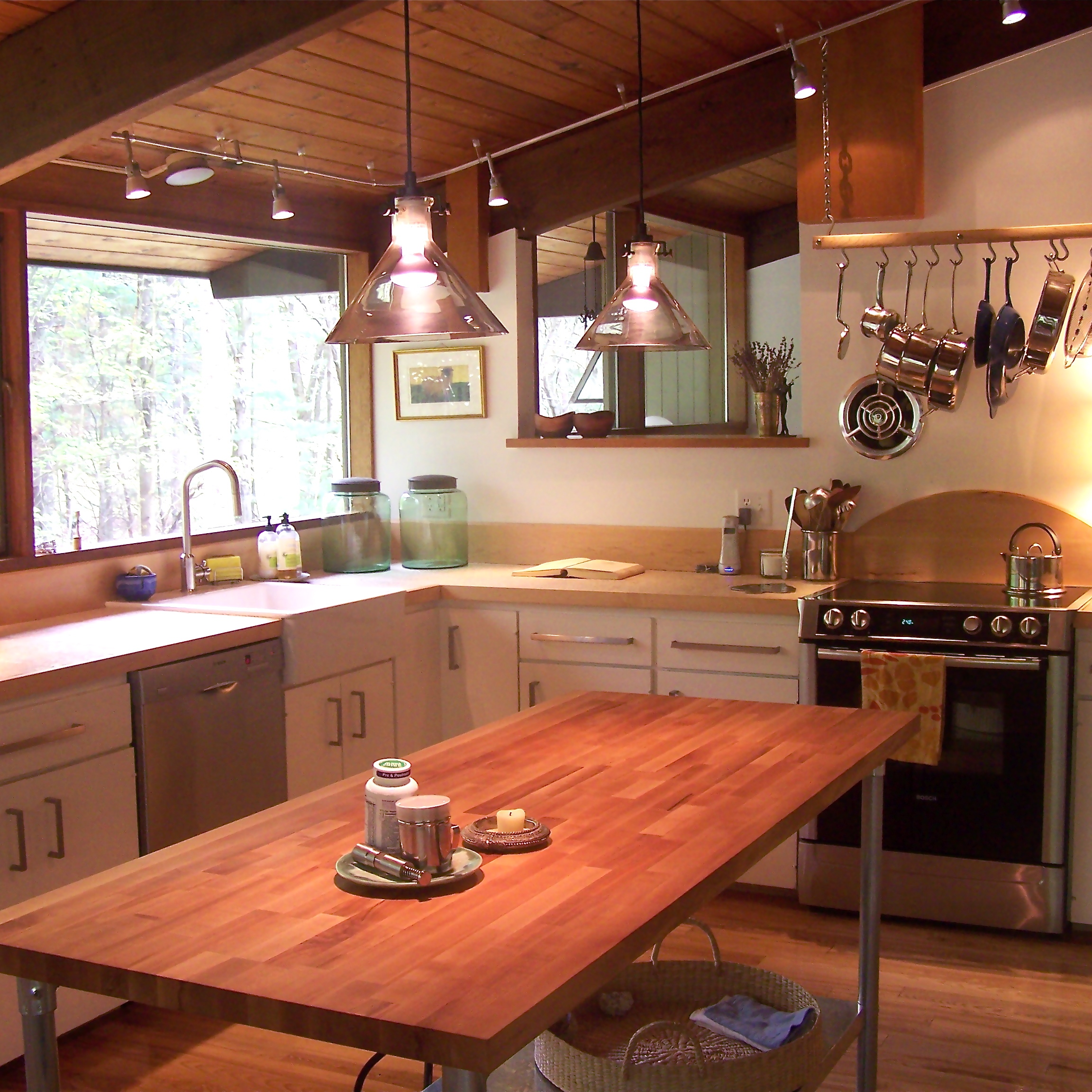
When I look at the kitchens I have created over the years, I see definite threads of style, materials, and colors.  These are different kitchens for different house styles-- a cottage, a farmhouse, and a contemporary-- but they have common themes of white and wood, tile, islands where there was room, and art.  

-Mary-Moore.
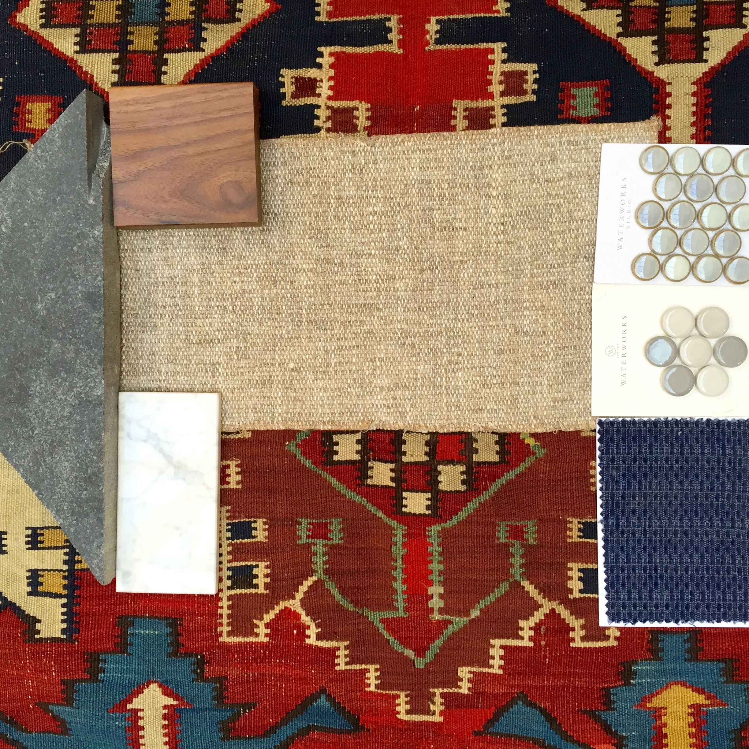
collecting samples

Sometimes I think that the photos I take of the the bits of stone and wood, tile and counter, rug and upholstery fabric--  all of them collected to represent much larger items-- are beautiful on their own.

Maybe this could be an art form of its own-- Sample Photos.

-Mary-Moore.
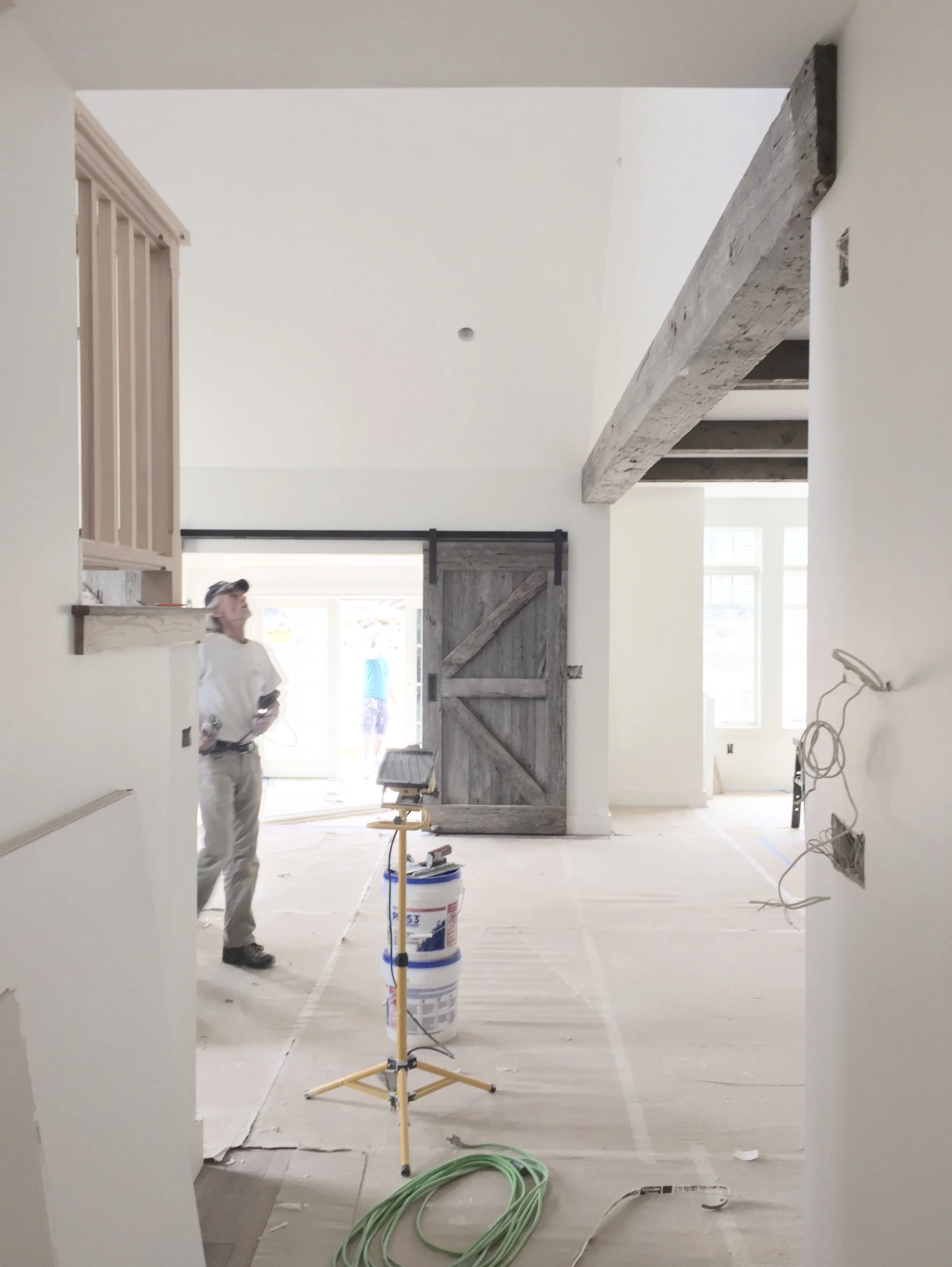
almost finished

There is the point in a big construction project where you can finally see how it is all going to come together.  The painters and finish carpenters and electricians and plumbers all come in and work their magic- and all the design elements of the building are at last in their places.  It is this moment,  the not-quite-finished moment, that projects often catch at my heart.  The bare bones of the architecture, the protective paper still on the floor, the finishing details all falling into place- before there is any furniture at all you can see how beautiful it will be.  

I love my job.

mary-moore.

photo styling vs. reality of life

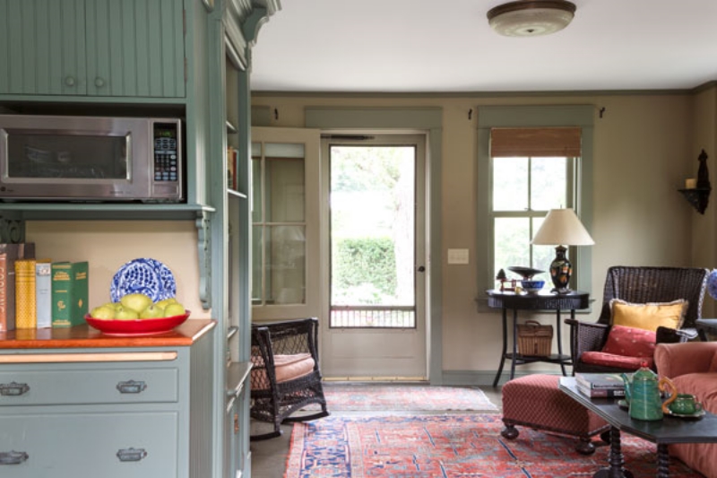
This photo was taken in July 2014-- on a photo shoot for This Old House magazine in Chatham, MA.  It is a lovely guest cottage- in the backyard of a gorgeous shingled family home.

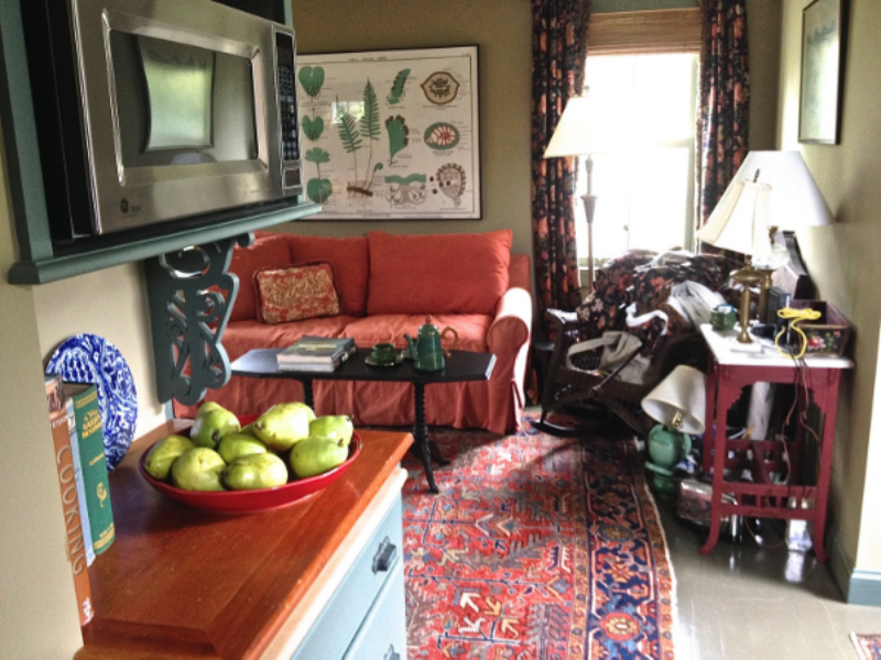
The following photo shows what was going on in the corner of this room during the photo shoot:

This is the reality-- no photo taken for a magazine is taken 'as is'.  It does not matter how beautifully the architect, interior designer, or home owner has arranged all of the amazing things that go into making a room look and feel good-- that same room has to be re-styled in order to make it look good for a photograph.  I think of this as taking a 3-dimensional space and making it look good for 2-dimensions.  It is not, actually, a pretty or glamorous process.

In this case the draperies had to come down, the homeowner's furniture had to be re-arranged, and many of her things needed to be removed from the shot.  This is a painful process for a homeowner!  I recommend that if you are ever asked to have your space photographed professionally that you spend those couple of days away from home.

The professionals will come in and create the photographs, and then put everything back afterwards-- hopefully just as you left it.  

mary-moore.

before and after
IMG_0155.jpg
1426354030608.jpeg

this before and after is of the beautiful living room of a very busy young family.  they had been living in the house for five years when they called me– long enough to settle in but not long enough to have figured out what to do with the pink marble fireplace surround and long blank wall of fairly narrow room.

but my clients have an amazing art collection– unbelievably beautiful things from all over the world– that made the direction to go in incredibly easy.  feature the art, downplay the stuff.  we built an enormous bookcase/ storage cabinet into the long wall– it is 9 feet long by nearly 9 feet tall– to hold many beautiful things AND hide many things that are useful but not so beautiful.  the cabinet needed to act as structural support for a major load-bearing wall holding up the second floor– but we turned this into a design opportunity by creating strong vertical columns within the bookcases.

the room is still a comfortable family space– but it is restful to the eyes and to the heart.

a good thing.

-mary-moore.